Tuesday, December 6, 2016

Self Portrait.


         The strongest area of my work in my opinion is the clothing in it because I'm wearing my clothing line. My clothing line means a lot to me and I like to wear it all the time. The area of work that can improved on is my shadows and light because I didn't use the dodge and burn tool, I just used a brush and changed the opacity.The dodge and burn tool would have most likely improved my project.
         The easiest aspect of this project was drawing and using the scanner to digitize the image. The scanner was easy to use and the drawing was fun to do. The most difficult part of the is activity was using Photoshop and Illustrator to edit the image. I've never used illustrator before and it was challenging to use. In Illustrator I used the lasso tool to select certain parts of the picture and move them around. In Photoshop I used the brush tool to draw my clothing line on the shirt.
         I demonstrated the objectives/goals by drawing an original image and using that as my base image. If i were to do this activity over again I would have used the dodge and burn tool and made better shadows and lights.


Sunday, October 30, 2016

Polaroid Project

The strongest area of the piece of work I made is the background in my opinion, because I scanned in some graffiti I drew, and also added a lot of details to the brick wall in the back. If I were to improve something in my project I would add more detail to the Polaroids, and the vines to make the picture flow more. This art activity was actually quite easy, it just took a while to finish. The only thing tough about it was trying to make the Polaroids look good, and having them overlap with the vines.

In this project I used Photoshop, pencil, and paper to create most of the details. Photoshop was were the image was being created. To create the graffiti in the background I drew it on paper, and scanned it into the computer.


Tuesday, September 27, 2016

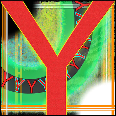
"Read Why"


The absolute strongest area of my work in my opinion would have to be the creativity and uniqueness behind it. The different layers of my image capture your eye and help to blend everything together. One part of my project I was not completely satisfied with was the background, I would have added more depth to it by inserting more lines behind everything. This activity was pretty easy because there were no guidelines, and no rules to limit my creativity.
The most challenging thing about this project was picking which letter to use, because there's 26 letters in the alphabet… That's like having a history project with 26 topics to choose from. My project was created only using Adobe Photoshop Cs6. Photoshop is a great way to create images because of all the tools it allows you to use, and the freedom of having separate layers.
The objective of the activity was to refresh our Photoshop skills, and to make a image with using just a letter. Both of these goals were accomplished in my project, even though i've kept up with my photoshop skills this was still a fun project to do. If i were to do this project over again i would do everything different, and choose a different letter, I could do this project 26 times.